
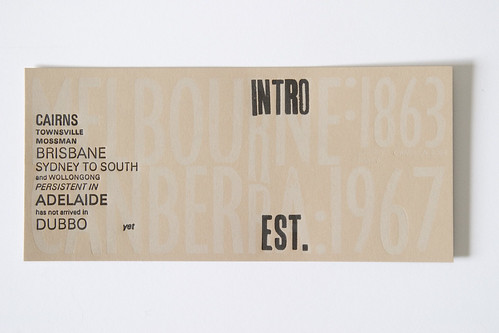
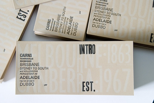
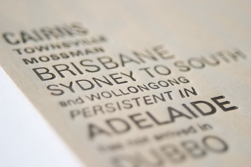
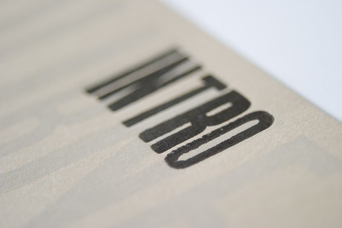
Second colour of the 400 Varied Noisy postcards for Raquel Ormella were applied yesterday afternoon, and they turned out well. Very difficult working with a mixture of wood and metal type in one forme. Finding enough contrast between the buff text and the black text was a challenge: if the background stood out too much, it was too confusing to read the whole. Overall, I think the type turned out well.


1 comment:
Those turned out great! I would love to learn all about letterpressing & maybe even have the chance to own one.
Post a Comment