Showing posts with label client work. Show all posts

Thursday, February 12, 2009

Claire & Adam


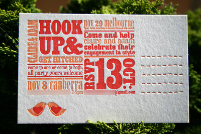
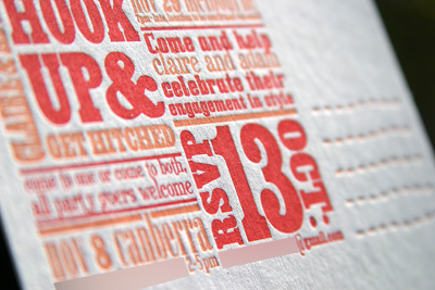
I recently worked with two dear friends of mine on their engagement invitation postcards. Being the creative folk that they are, Claire and Adam designed and screenprinted a tree graphic on the front of the card, then had Poppy print the details on the back with the press.

I'd love to do more collaborations like this. I find that letterpress can look incredibly effective when combined with other types of printing. And it's quite easy to match the ink colours as well.

Wednesday, February 11, 2009

Rosemary & Kui


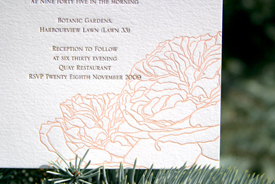
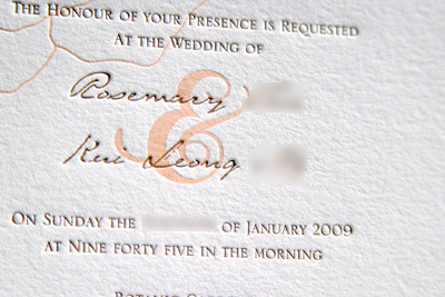
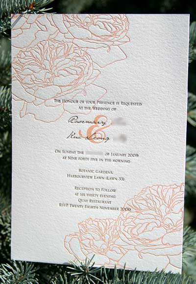
I loved working on this design. The peachy colour was so unique, and I really enjoyed drawing flowers for a while. It turned out to be such a clean, crisp design, and is one of my personal favourites.

The font for the names printed so well that it looks like actual handwriting. I'd encourage more brides to use fonts like this. It's classy, but still has that personal touch to it.

You may recognise the flowers from Eessu's first print. I had the plates handy after finishing these invites, and couldn't help but print from them again. Even in black they still look so feminine and soft.

Monday, February 9, 2009

Kate & Rob

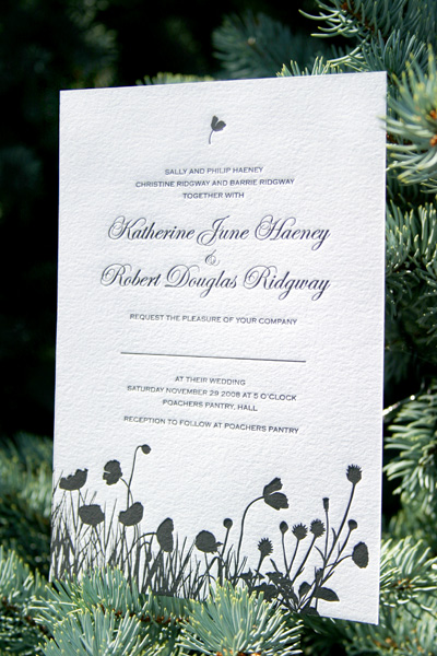
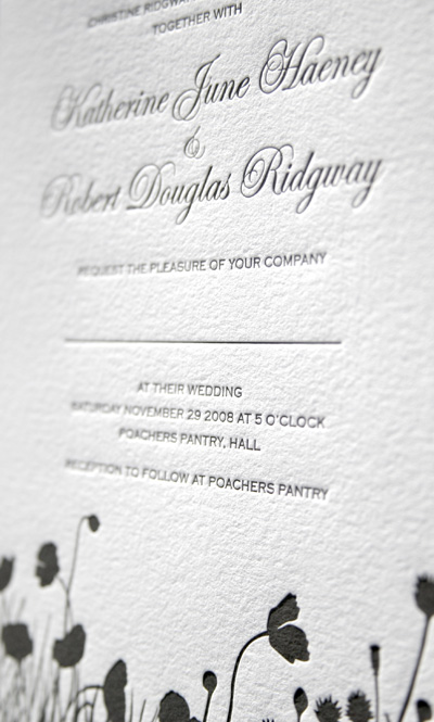
We had the pleasure of working on this design with Kate and Rob recently. Like many couples these days, Kate and Rob wanted to steer clear of complicated and elaborate designs, and instead focus on the country garden theme of their wedding. Kate is lucky to have an aunt to handle the calligraphy of the guest's names. The names were written in a yellow, so the invitation needed to be simple and neutral.
Saturday, February 7, 2009

Rob & Elizabeth


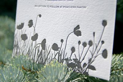
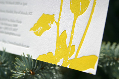
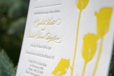
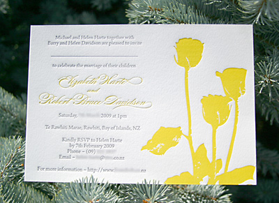
We love printing our own designs here at Poppy, but clients also have the option of submitting their own artwork, which is exactly what Rob and Elizabeth opted for. It was so refreshing to print this sunny yellow and charcoal combination straight after printing black only for a couple of days. I think yellow is really going to be big this year, and you can see why - it's just so happy!

Thursday, February 5, 2009

Sharlene & Alex


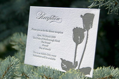
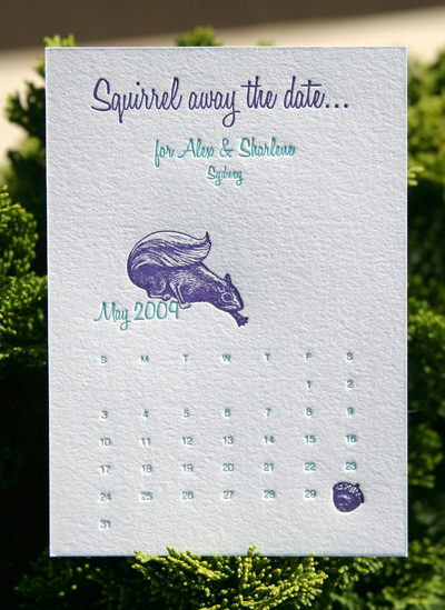
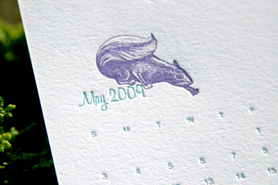
I ended up going mad for squirrels over this design - they're just so cute. Sharlene loves squirrels, and really got me hooked. This simple and quirky design let the couple have a bit of fun with their stationery, before needing some more serious invitations later on.

The little squirrel was hand-drawn at Poppy. We love creating custom illustrations for designs. It's one certain way to ensure that your concept is original and fun!

The backs of the Save the Dates held adhesive magnets, so family and friends are able to stick them to the fridge for reminders.


Tuesday, September 9, 2008

Lara & Adrian

Click on images to enlarge and see in better resolution


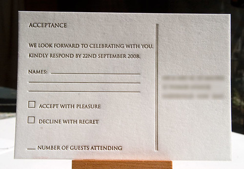
This is a print proof of Lara's rsvp card. I've made it a bit of a policy now to send proofs so clients know exactly what to expect. It can be a lot of extra time and hassle for me, but worth it in the end.

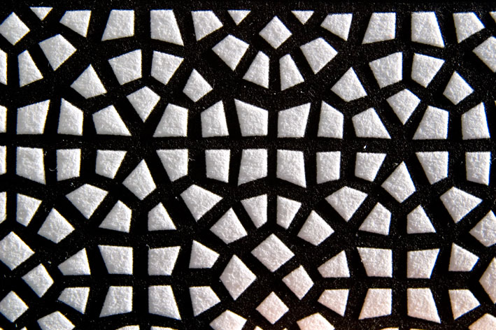
I'm thoroughly enjoying this wedding set. The pattern I took from the moorish screens in the restaurant where Lara and Adrian will be having their reception. I'd just love to see the guests arrive and make the connection on the night.

I have quite a few items to print for this set, so stay tuned, as I'll be working on them in the next few days.

Talia & Grant

Click on images to enlarge and see in better resolution


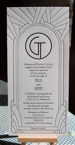
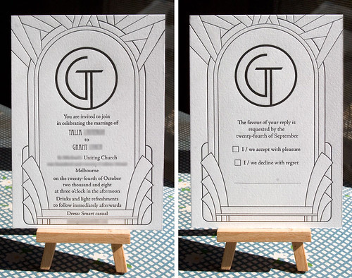
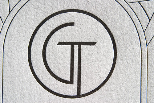
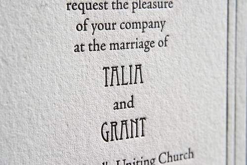
We actually printed this set a couple of weeks ago but it's taken me a while to get the camera out. This design was supplied by the client, and it was great to work with. Clean lines, crisp black ink, and the press was doing a great job of behaving itself for once.

Talia's set also included rsvp envelopes with return address printed.

Wednesday, August 20, 2008

Kelvin & Michelle


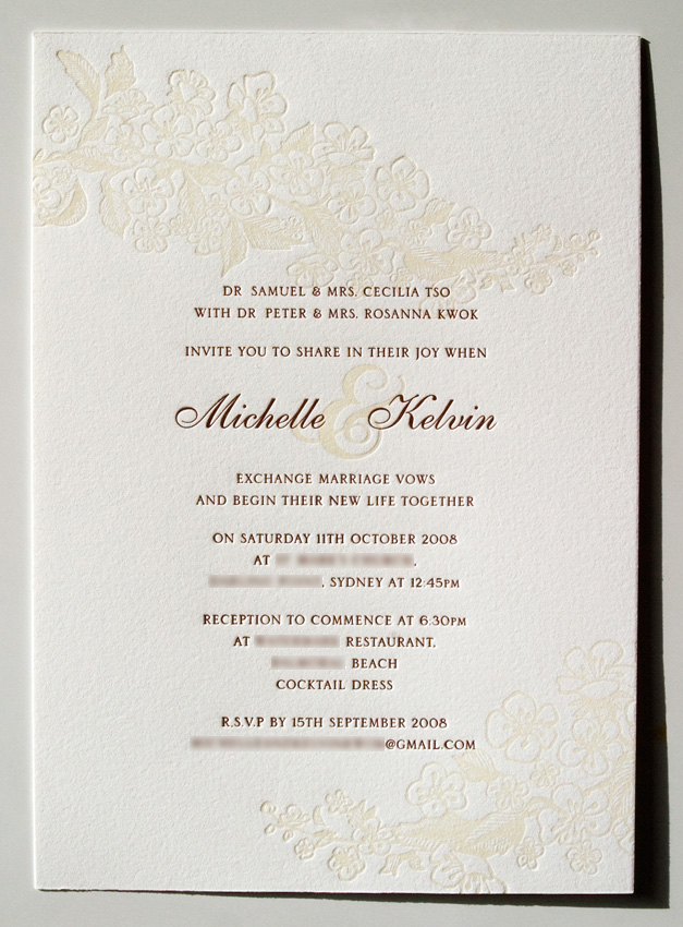
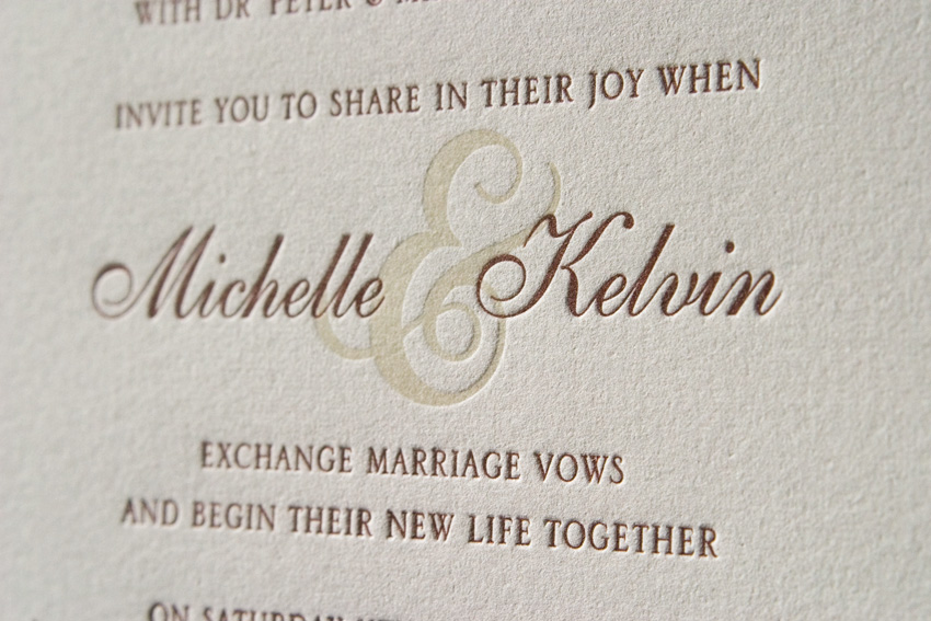
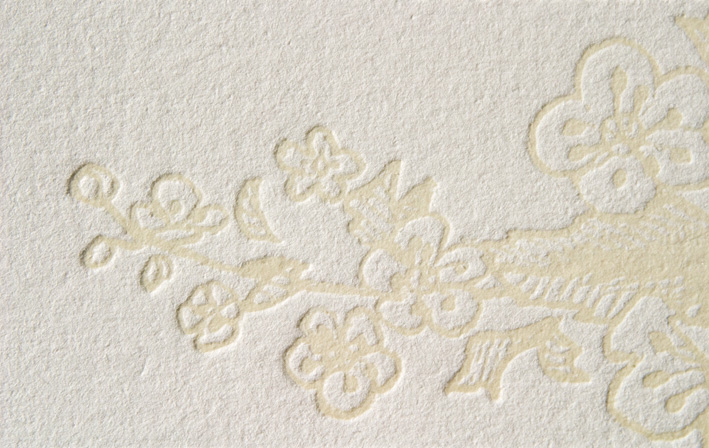
I'm very happy with how the illustration on these invites turned out. You may remember that I posted the sketch of these flowers in a previous post. We discussed printing the flowers as a blind deboss, in transparent white, or in a light beige. In the end, we went for a transparent white with a hint of beige, and the result is subtle, but still allows the ampersand to be dark enough to link the two names. The text is printed in a chocolate brown.

Design, illustration and printing by Louise Redman of Poppy Letterpress.

Saturday, August 16, 2008

Susie & Matt


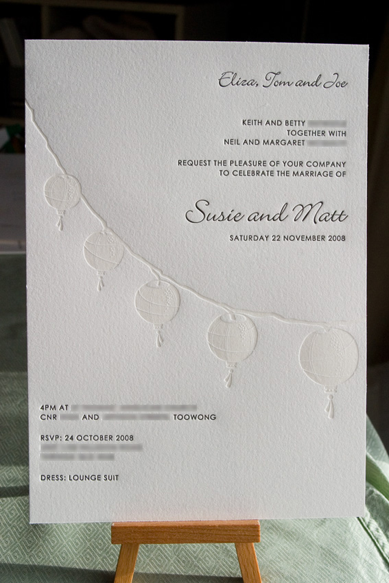
Our latest wedding invitations are for Susie and Matt in Brisbane. Matt's grandmother is Chinese and they wanted to incorporate some Chinese tradition without it dominating the look and feel of the wedding. Susie is a goddess of decorating and will be arranging Chinese lanterns around the restaurant for their cocktail reception, so we've kept that theme running with the invitations.

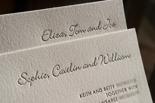
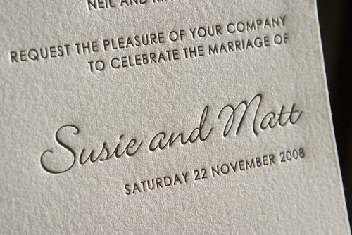
Text is printed in charcoal grey, with the lanterns in transparent white. We will be following these up with booklet covers in coming weeks.

Monday, August 11, 2008

Maria & Glen


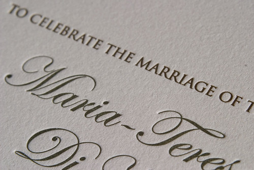
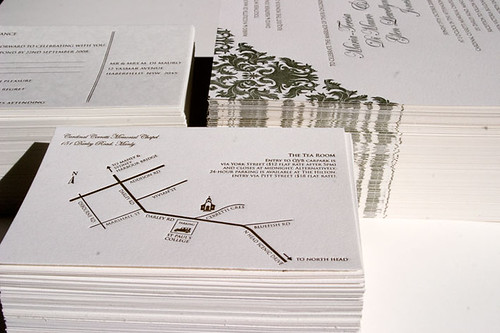
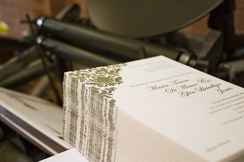
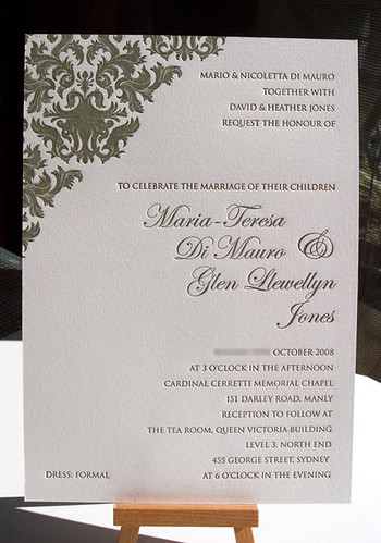
I had a great weekend printing Maria & Glen's invites for their October wedding. There's still a few more items to come, but here are some pics of their invitation, RSVP postcard and directions map. Design is by Poppy, from Graphista Design. It was wonderful working with Poppy, as she had such beautiful artwork and it was supplied in a lovely clean file. I'm really quite particular about keeping files clean and ordered, and Poppy's artwork made my job so much easier.

Click on the images for detailed view:


The press is behaving exceptional well at the moment, and I'm thoroughly enjoying the printing process - even when it started snowing halfway through printing these cards. No, my print room doesn't have heating, it was about -1C (30F) in there on Sunday! Amazingly, the press still works fine. The ink is a lot harder to mix as it's really thick (like mixing brie), but once on the press, no problems.

Sunday, July 27, 2008

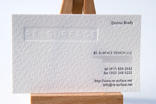
Re-Surface Re-print


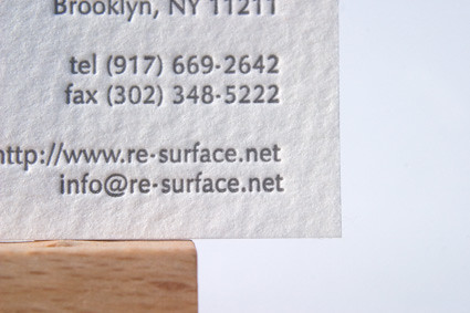
I reprinted these for Donna a couple of weeks ago, but hadn't had the chance to upload the photos yet. We tried a stiffer, more textured card this time, and it worked a treat. BFK Rives is a perfect stock for inviations and such, but just doesn't cut it as a business card stock - it's not hardy enough.

Saturday, July 5, 2008

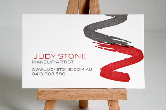
Judy Stone Makeup Artist


I actually printed Jude's cards a few days ago, but hadn't got around to blogging them yet. I used the same stock as I did for Kate Luke's business cards, and probably won't be doing that again. It was a Canson card from memory, and although 300gsm, it's really just too stiff to get a decent impression out of. BFK Rives is a beautiful stock for printing on, but gets damaged too quickly for business cards, so I'm on the lookout for a great new stock.

If you're in the Canberra area and need a makeup artist, Jude's fantastic, so give her a call!

Sunday, June 22, 2008

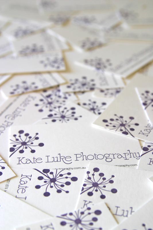
Kate Luke Photography


After messing up the guillotining on the first print run, Kate's cards are now ready and I'll be delivering them tonight. There's just something so satisfying about seeing a completed job.

Monday, March 24, 2008

Re-surface business cards


Today I printed 120 business cards for Re-surface in Brooklyn. They've got some pretty original lampwork, so make sure you check it out. I'll be posting these cards to Donna tomorrow.

Lesson learnt today: although the guillotine can cut a stack of 400 sheets of office paper straight, it can't manage the same with more than 30 sheets of Rives. Therefore these cards are 88mm long rather than 90mm, as I had to retrim a few as I learnt this lesson!