
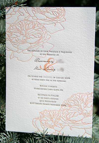
I loved working on this design. The peachy colour was so unique, and I really enjoyed drawing flowers for a while. It turned out to be such a clean, crisp design, and is one of my personal favourites.
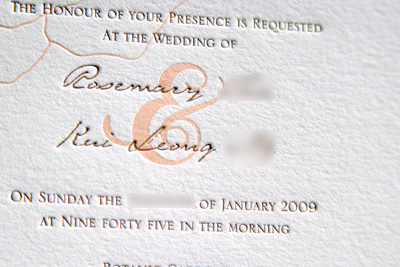
The font for the names printed so well that it looks like actual handwriting. I'd encourage more brides to use fonts like this. It's classy, but still has that personal touch to it.
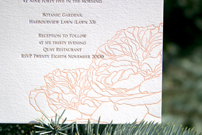
You may recognise the flowers from Eessu's first print. I had the plates handy after finishing these invites, and couldn't help but print from them again. Even in black they still look so feminine and soft.


2 comments:
Love the illustrative qualities of the flowers. Your eye just follows the lines all over and around. Lovely.
These are so lovely. I really enjoy reading your blog and seeing your designs and the finished results. Thanks for sharing your creations with us.
Post a Comment