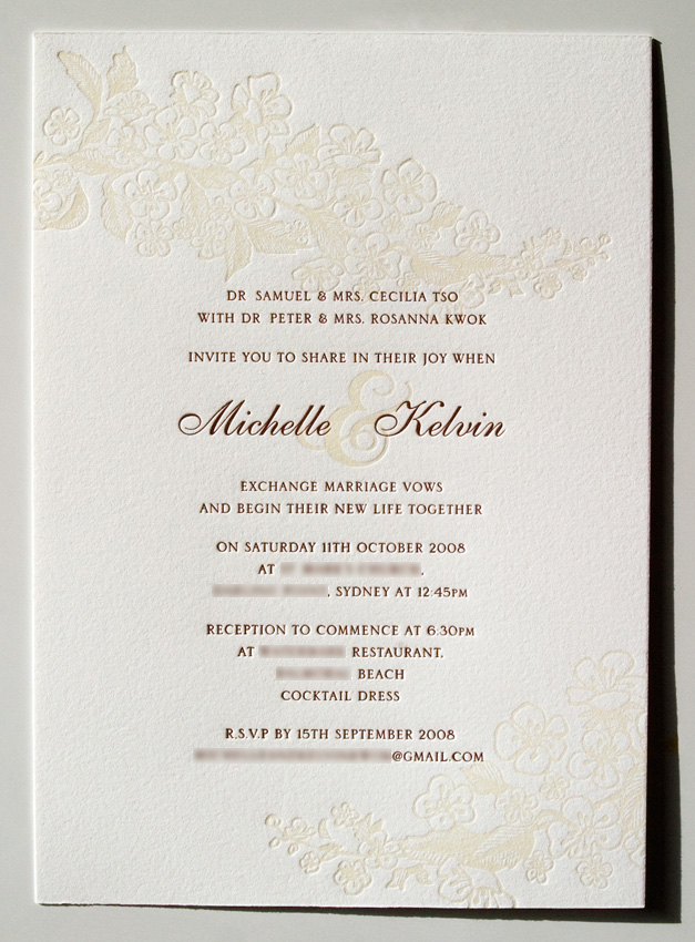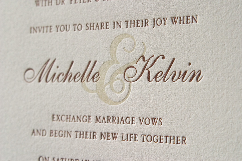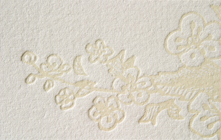


I'm very happy with how the illustration on these invites turned out. You may remember that I posted the sketch of these flowers in a previous post. We discussed printing the flowers as a blind deboss, in transparent white, or in a light beige. In the end, we went for a transparent white with a hint of beige, and the result is subtle, but still allows the ampersand to be dark enough to link the two names. The text is printed in a chocolate brown.
Design, illustration and printing by Louise Redman of Poppy Letterpress.


1 comment:
that is such a lovely design. it looks like lace at first glance, and when you look again the detail of the blossoms is even more beautiful!
Post a Comment