
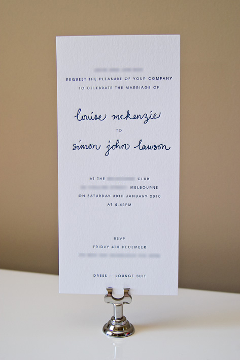
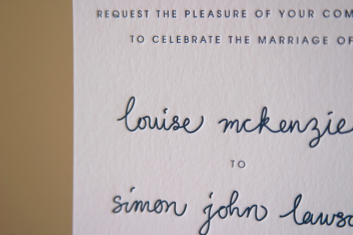
Recently we worked on these cute and simple little DL invitations. Louise liked the hand-drawn look of the names, and we loved working freehand for a change!
These are a great example of how you can still have letterpress invitations for your wedding even if you're on a tight budget. Using just one ink colour doesn't have to be boring! In fact, the tactile nature of letterpress means it isn't always necessary to have a detailed design to make an impact.


4 comments:
love this invite so very much. can i ask what font is it?
The names? That's my handwriting :)
that came out really nice. what font is the rest of the card? i really liked how it's quite clean next to the handwritten names. :)
Hrm, a gothic of some sort from memory. Haven't got the file on this computer to check...
Post a Comment