
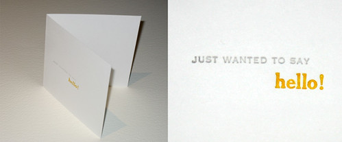
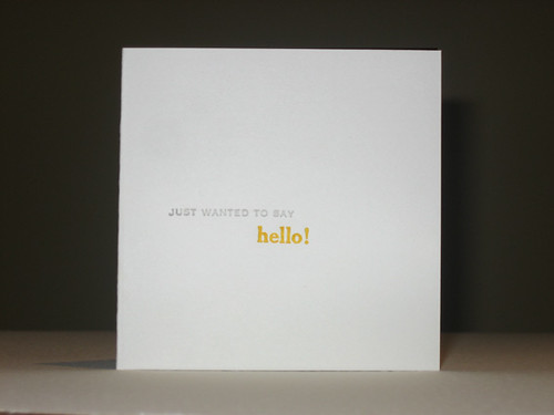
My first attempt at greeting cards. This was only meant to be a learning process, but it really pointed out that there's a long road ahead for me if I want to eventually produce something good.
Problems with this job:
- having issues trying to get the whole line/word even. The "J" in grey is heavy, and I just can't get it right. I'm having the same problem with the top of the orange ascenders. I've spent a great deal of time adjusting tympan and impression knobs with little success. Sigh.
- ink weight vs. impression. I think this will just have to be trial and error... but if anyone out there has a simple formula for this, do tell!
In happier news, I've found TWO places in NSW that can make photopolymer plates. One of the suppliers is looking at some artwork I emailed earlier this afternoon to determine if it will reproduce effectively. I'll post the details when I bring them home from work. I might send an artwork to each to compare results. I think for wedding invitations, I'll have to go with a magnesium plate from Owossa Graphics, though.
Although I'm learning rather quickly, I'm not sure if there's a specific type of project I should start with, like an assignment - i.e. single big word prints, line art, solid art, plates, lines of text, single colour, multiple colour, kiss impressions... Any suggestions?


No comments:
Post a Comment